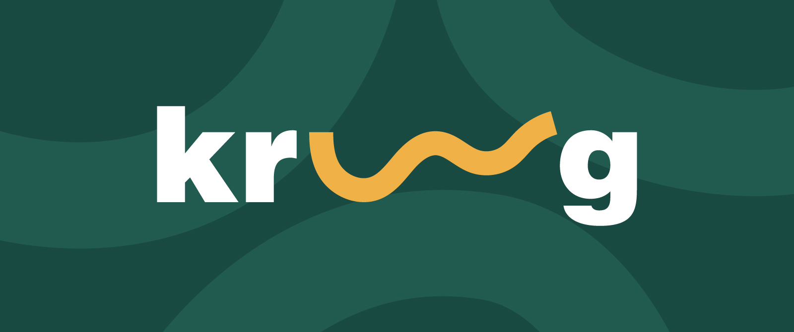
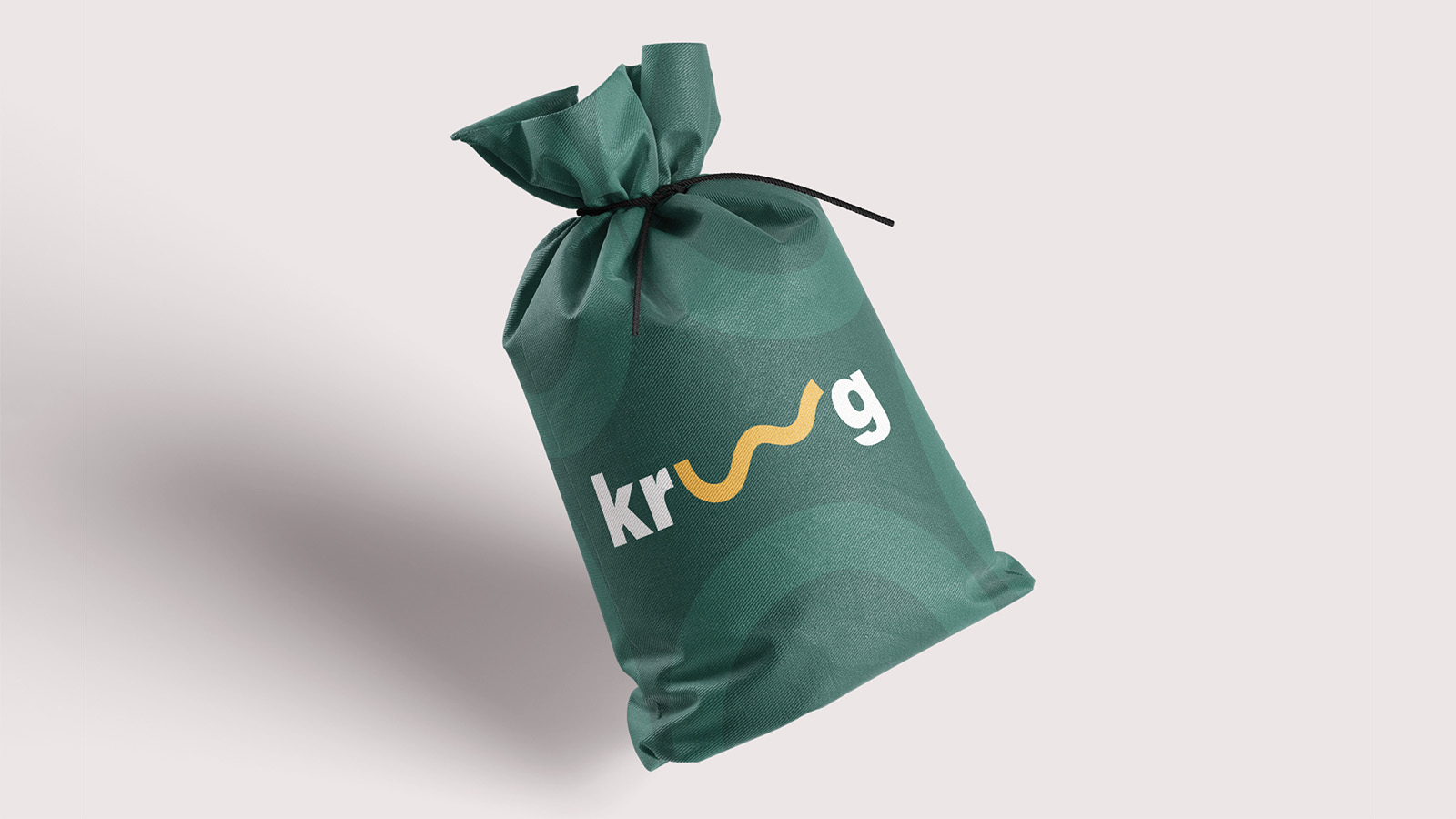
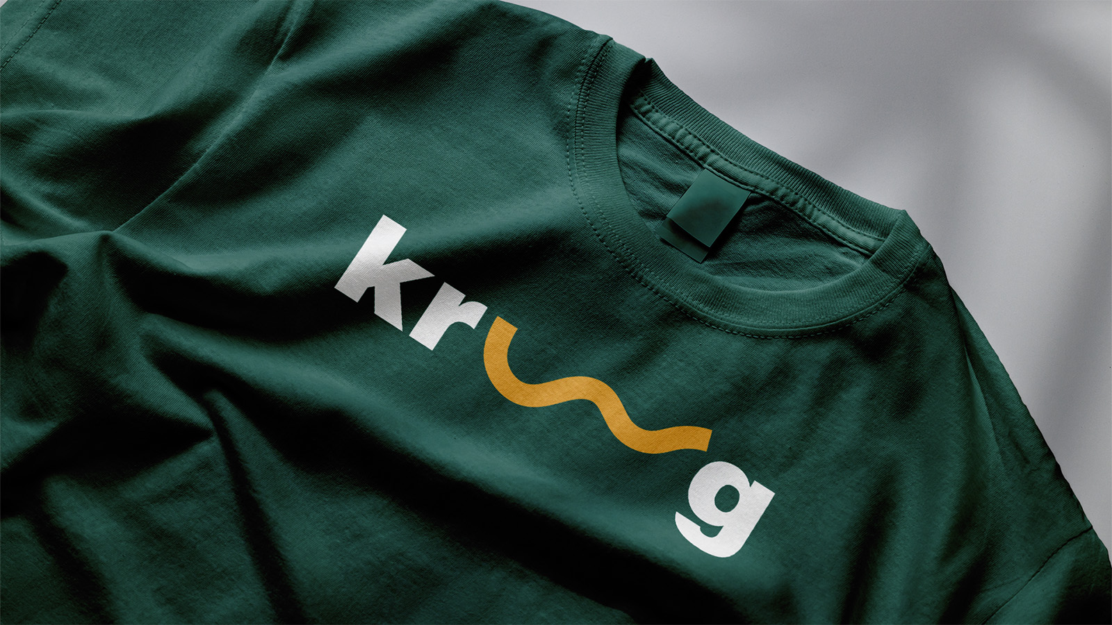
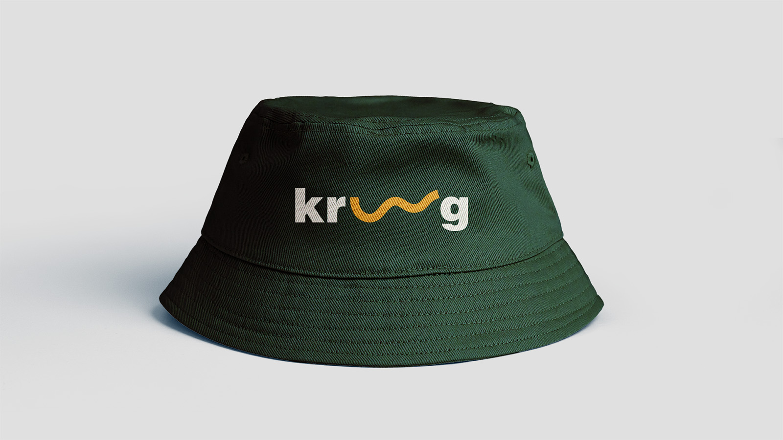
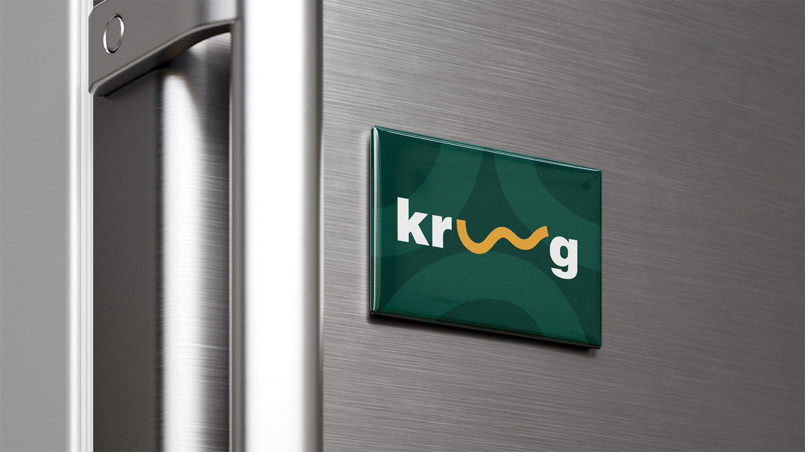
For the Kroog project, a children’s play center aimed at older children, we developed branding that reflects energy and playfulness. The client initially envisioned the logo inspired by an infinity symbol using the letters “oo,” but through the development process, we arrived at a unique solution. Instead of the classic infinity symbol, we designed a curved line that represents limitless play, capturing the energy and freedom characteristic of the age group the play center targets. The logo is bold and modern, creating a strong visual connection to the brand’s theme and concept.
The play center offers activities like billiards, PlayStation, darts, cinema, and other fun experiences that let children have fun and socialize. This design combines creativity and functionality, providing a strong brand identity that invites play and fun.